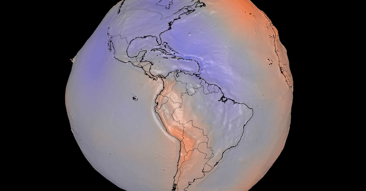
NASA’s new NASA geoid model makes Earth look less like a polished marble and more like a badly handled clay ball. That is the point: the 3D visualization shows the shape of Earth’s gravitational field, not the planet’s familiar surface as seen by cameras in orbit.
The model shows small highs and lows in gravity caused by uneven mass inside Earth. NASA says another way to picture the geoid is as the level a planet-wide ocean would take if only Earth’s gravity and rotation shaped it, with winds, tides and currents removed from the equation. In other words, it is a physics surface, not a vacation brochure.
NASA’s visualization exaggerates the geoid’s vertical differences by a factor of 10,000 so people can actually see the structure. Without that inflation, the variations would be too subtle for a useful visual. NASA credits the work to science adviser Scott Luthcke and visualizer Mark SubbaRao at NASA’s Goddard Space Flight Center.
What is NASA’s geoid model?
A geoid model is a map of how Earth’s gravity varies from place to place. Those differences come from how mass is distributed through the planet, so satellites can detect tiny changes that are invisible in ordinary photos.
NASA built the new lumpy Earth from satellite models and observations that measure small gravity differences across the globe. According to NASA, the dataset covers 15 years and includes about 1 billion observations. The agency also posted an interactive 3D version and a longer video for anyone who wants to spin the planet and inspect the weird bits themselves.
Why gravity satellites matter beyond the visual
The gee-whiz image is the least practical part of the work. NASA and the European Space Agency operate satellites that monitor Earth’s gravitational field, and those measurements have become a way to track moving water and ice. Gravity changes when large amounts of mass shift, which means satellites can register ice sheets shrinking or groundwater disappearing.
NASA says observations from the Gravity Recovery and Climate Experiment, known as GRACE, show Antarctica lost about 135 gigatons of ice per year from 2002 to 2025. Over the same period, Greenland lost about 264 gigatons of ice annually, according to NASA’s GRACE data. Better estimates matter because melting land ice is one of the inputs scientists use to assess current and future sea-level rise.
GRACE observations are also used to monitor groundwater loss and drought. The data show long-term groundwater depletion in the western United States and other regions, according to NASA-linked GRACE material. That is a blunt instrument for a local water problem, but it has one useful trait: it sees mass changes over large areas, whether local politics wants to talk about them or not.
More immediate drought signals show up as well. NASA-related GRACE data indicate the extreme dryness contributing to fires in Spain and France this summer is visible in the gravity record. A University of Nebraska analysis using gravitational observations shows soil moisture and shallow groundwater in parts of the region at or near record-low levels.
As climate change worsens drought in many places, the practical value of these measurements is less about making Earth look strange and more about giving water managers another read on what is vanishing underground.
This story draws on original reporting from WIRED.