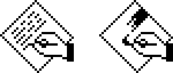
A current argument over Mac application icons has sent one Mac writer back to the original Macintosh, where the design box was very small and very literal: 32 by 32 pixels, all black or white.
In a July 7 post, Dr. Drang responded to Paul Kafasis’s recent Rogue Amoeba blog post calling to “Free the Icons,” a slogan aimed at what Mac users have been calling “squircle jail.” The complaint, as Dr. Drang describes it, centers on icons losing parts that extend beyond a uniform rounded-square shape.
Dr. Drang said he agrees with that cause. His contribution is historical: early Mac icons were also governed by a strong visual grammar, just with different constraints and, in his view, more room for charm.
The original Mac pattern
According to Dr. Drang, the classic Apple examples were MacWrite and MacPaint. Both used a tilted rectangular shape with an image inside to suggest the application’s purpose. A hand appeared as a cue that the icon represented something the user could act with, and the rectangle’s tilt matched the hand’s orientation.
Document icons followed a different convention. Dr. Drang describes them as upright rectangles with dog-eared corners and related imagery inside. They did not include hands, because documents were passive objects rather than applications.
Apple reused the same app-icon idea in MacDraw and HyperCard, though HyperCard changed the formula by showing a stack of rectangles. Dr. Drang notes that the top card had no interior image, likely because the available pixel grid left too little space.
That early design language matters to the current icon fight because protruding elements were part of the Macintosh icon vocabulary from the start. The hands in those original application icons stuck out beyond the tilted rectangles, which is exactly the sort of visual feature critics say gets lost under today’s more uniform app-icon treatments.
Third-party developers copied the cues
Dr. Drang points to Aldus PageMaker and QuarkXPress as examples of other publishers adopting Apple’s approach. Both used the tilted-rectangle-and-hand language, though Aldus drew the hand differently.
The similarity also exposed a practical issue that the early Mac mostly avoided: there was no Dock. Users launched software by locating an application icon on a disk and double-clicking it. Dr. Drang notes that the application name appeared beneath the icon, which helped distinguish visually similar apps such as PageMaker and QuarkXPress. He also acknowledges that users could launch an app through one of its documents, while setting that aside as a different icon category.
THINK Pascal took another route. Dr. Drang says its icon kept the hand motif but replaced the pencil metaphor with two hands on a keyboard producing a flowchart, a better fit for programming than drawing or writing.
Over time, those cues loosened. Dr. Drang says publishers dropped the hands, the tilted rectangles, or both as Mac users became more familiar with the system. Apple also moved away from the pattern for utilities such as Disk First Aid and Font/DA Mover.
His favorite Apple icon from that period is ResEdit, which he presents as an example of the whimsy old Mac users remember. All of the icon images in his post, he says, came from screenshots taken in an Infinite Mac session.
This story draws on original reporting from Daring Fireball.